Del Olmo Law
Situation
Starting out as an attorney must be a challenging task in itself (from what we hear), but trying to stand out in the crowd of faceless suits, established attorneys and large Boston firms, is bordering on impossible.
Solution
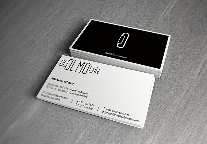
Make a simple, elegant, but clever logo that a potential client or partner will remember, and designing a business card on a thick and rich paper that feels just right in the client’s hand.
Result
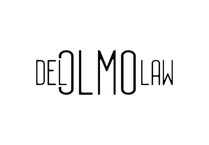
The logo was designed with two layouts in mind. The first logo has the company name spelled out (Del Olmo Law), with the prefix Del intersecting into the first letter O of the last name Olmo. The secondary logo mimics this approach using only two letters (D from Del and Ofrom Olmo) which creates a clever visual: a paper clip. For the business card, we stayed in black and white to keep the look traditional and sleek. The front of the card is standard–black letters on a white background–while the back is the reverse: completely black, only displaying the icon logo in white and a company URL, with a white border to balance out the darkness of the all black background and add an additional interesting visual element.


